Today I’m doing a guest presentation at Binghamton University for Lawrence C. Stedman’s Education 680: Principles of Visualization and Data Analysis. In the process of preparing, I created this post, which you will also find linked at the left of my home page.
One Way to Use a Correlation
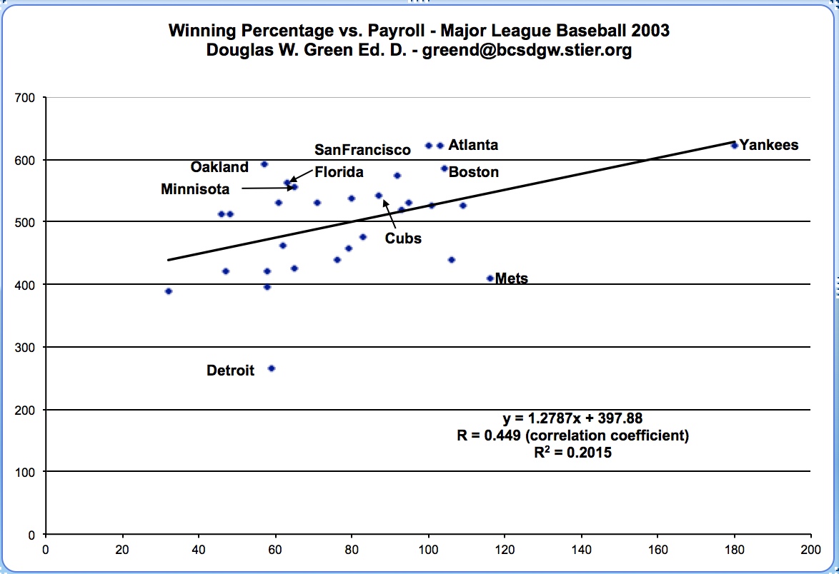
With an r squared of about 0.2, it means that money counts for 20% of the wins. This can make a difference, but not with every team. The teams above the line get more for their money.
Why You Can’t Trust Some Statistics
The Trouble with Averages: The Impact of Major Life Events and Acute Stress May Not Be What You Think – Anthony Mancini, Ph.D.
Coontz, Stephanie, When Numbers Mislead, The New York Times, May 25, 2013.
Orin, Ben. Why Not to Trust Statistics, mathwithbaddrawings.com, July 13, 2016. These simple drawings show you in an easy convincing manner how any statistic can be misleading.
Weinberg, Neil. Stats to Avoid: Batting Average, FanGraphs.Com, February 20, 2015. This is a good example of a poplular use of average that has been recently discredited.
Books That Debunk Current Federally Mandated Testing and Therefore Any Data Visualization Done With Them – Links to my summaries are included.
Zhao, Youg (2016). Counting What Counts: Reframing Education Outcomes – Yong Zhao and friends take on the current system with its focus on standardized tests and their sole focus on cognitive skills. Chapters are devoted to defining a variety of non-cognitive skills that are connected with success in life and the current status of how to assess them. They make a case for a new paradigm that would move the system towards more personalized learning and assessment.
Harris, Phillip, Smith, Bruce M., and Harris Joan (2011). The Myths of Standardized Tests: Why They Don’t Tell You What You Think They Do – This provides great ammunition for anyone who wants to join the fight against the test and punish reforms that schools and students are currently suffering from.
Amrein-Beardsley, Audrey (2014). Rethinking Value-Added Models in Education: Critical Perspective on Tests and Assessment-Based Accountability – This describes and analyzes the imposition of value added test-based evaluation of teachers, the theory behind it, the real-life consequences, and its fundamental flaws.
Kamenetz, Anya (2015). The Test: Why Our Schools Are Obsessed with Standardized Testing – But You Don’t Have to Be – Anya Kamenetz explains in some detail the ten things wrong with state tests along with some history and politics. She goes on to tell educators and parents what they should do to help kids survive the madness. Anyone who dislikes state test should get this book.
Kuhn, John (2013). Test-and-Punish: How the Texas Education Model Gave America Accountability Without Equity – John Kuhn follows the history of the modern education reform movement from its roots in Texas. While the tone is strongly one-sided, John makes a compelling case for reforms that diagnose-and-support and finds a way to finance schools in a more equitable manner. If you haven’t joined his battle, it may be time.
A Book Explaining Item Response Theory
Partchev, Ivaiol (2014). A visual guide to item response theory, Friedrich-Schiller-Universitat: Jena, Germany. This is pretty nerdy, but it has some graphs that help you understand the concept.
Infographics and Data Visualization Explained
What Is an Infographic? And How Is it Different from a Data Visualization? These visuals are easily confused with other forms, despite having their own unique history, design, and purpose. @vismeapp
Big Data Exploration – This graphic provides a nutshell glimpse of the discipline.
13 Reasons Why Your Brain Craves Infographics – This is brilliant and research-based.
How to Make an Infographic: A Visual Guide for Beginners [Free E-Book] In a world of information overload, the ability to visualize information is more than just a nice-to-have skill — it’s now a necessity.
Ten Expert Tips on How to Choose Color Schemes for Your Infographics – This contains color knowledge that everyone should know.
Examples of Data Visualization from DrDougGreen.Com – Dates are when they were posted.
5/24/17 Which States Have The Smallest Gender Gap In STEM Occupations? Maryland has the smallest STEM gap with 2.1 men for every woman. The state with the largest gap is Utah at 4.5. How is your state doing? @investzen
5/7/17 With This Interactive Font Map, You Have No Excuse For Defaulting To Helvetica On Everything. IDEO’s Font Map, an interactive typography map built using an AI algorithm, however, makes the process of exploration and selection much easier. @IDEO
4/20/17 Gerrymandering is Illegal, but Only Mathematicians Can Prove It. Studying state maps to look for gerrymandering could be a good student project. This is a great infographic. @EricaKlarreich @QuantaMagazine @wired
3/4/17 One Year Of Air Traffic Around The World, Visualized – This interactive map is pretty cool. Click and drag to move the world. @galka_max @Digg
1/13/17 The Sex Ratio of Each State and County in the U.S. This interactive map will tell you what the deal is in your county. Most counties have more females. Can your students explain this data? @overflow_data
11/14/16 However Deep You Think The Ocean Is, It’s Way Deeper Than That. This is an example of how animated video and visualize data. @RealLifeLore1
10/25/16 An Animated Map Of Unemployment In The US From 1990 Until Today – What does this reveal about the subject. This is an example of using the time-lapse technique for data visualization. @flowingdata @Digg
8/5/16 A Breathtaking Timelapse Of The Never-Setting Arctic Sun – This uses time-lapse photography to help visualize a natural phenomenon. @WitekKaszkin @billstankay
8/3/16 Watch as the world’s cities appear one-by-one over 6,000 years. Another example of time-lapse. There is a ton of learning here. It does a great job of showing where civilization started and spread. @galka_max @DrEdwardMooney @jordosh
7/22/17 How Much Space Does $1,500 Rent You in the 30 Most Populous US Cities? This is an extremely cool interactive representation of data. Hover over the tiles and see how much space $1,500 gets you in the 30 most populous US cities. @Balazs_Szekely @RENTCafeApts
First Time Posted 7/11/17
Interactive Map for the August 21, 2017 Solar Eclipse – This may be my all time favorite as it is so informative.
Track National Unemployment, Job Gains and Job Losses
Wage Winners and Losers since 2004 You can enlarge the map and when you roll over a county, it’s data is revealed.
Executive Compensation Graphic – Roll over each dot to see what the CEO makes. There is also a table, which might be easier to comprehend. Always include a table where your audience can see the real data.
An Explanation of How Growth Scores Work
Growth Scores Explained In New York State – Note that when you use percentiles you have a zero sum game as in order for some students to move up the percentile ladder, other students must go down. This means that the average teacher score will not change. Also, note that there are no credits at the end. I suspect that this is the case due to the fact that it was produced by the same people who sell the tests and the value-added model to the state.
Dr. Doug’s 1st Visme Project
It took me just about an hour to learn this product and make this infographic. Consider giving this product a try.
Share this:


 DrDougGreen.com If you like the summary, buy the book
Dr. Doug’s 1st Visme Project
It took me just about an hour to learn this product and make this infographic. Consider giving this product a try.
Share this:
DrDougGreen.com If you like the summary, buy the book